|
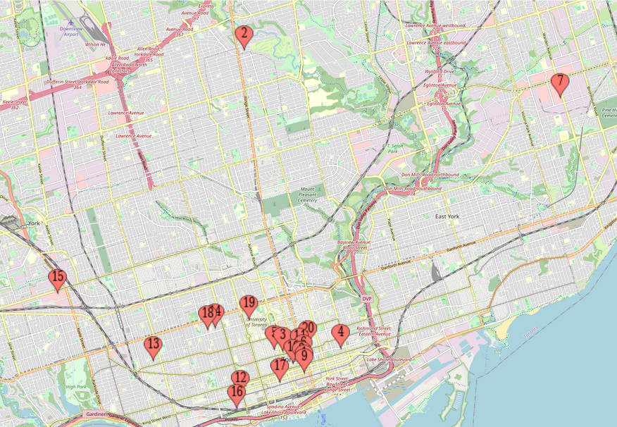
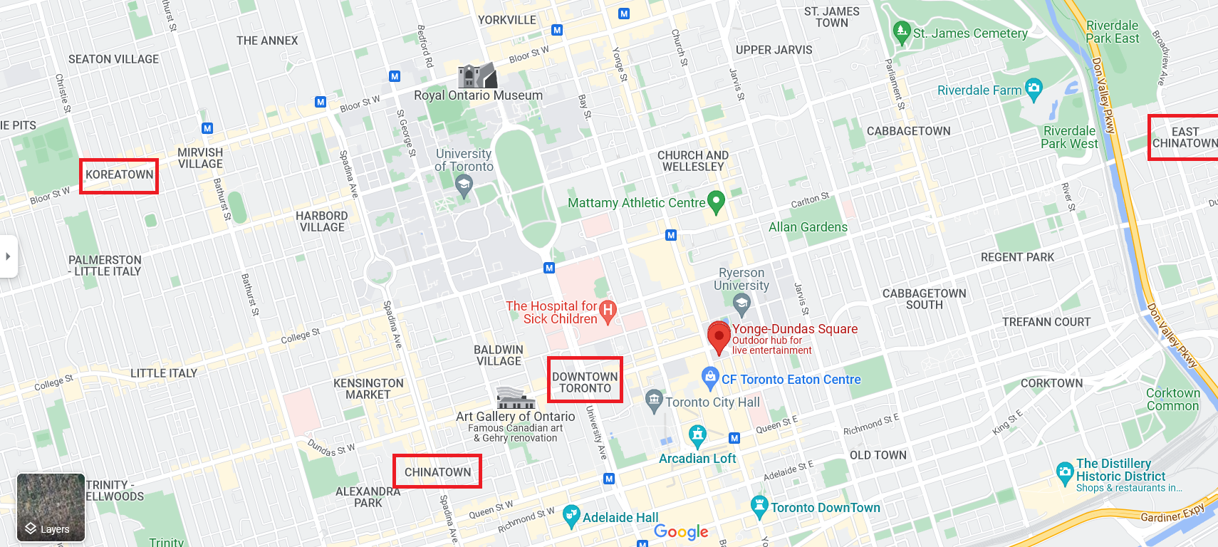
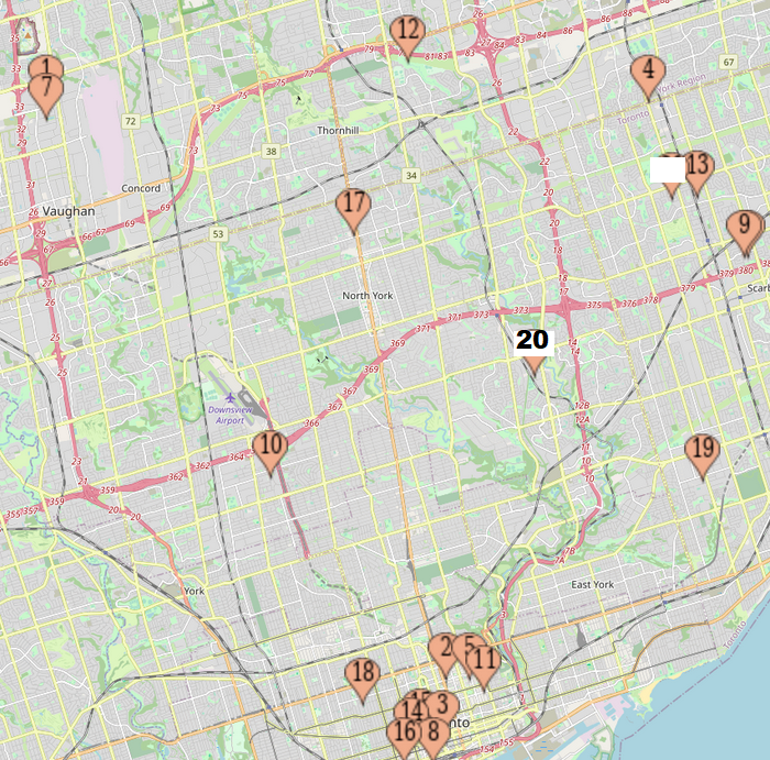
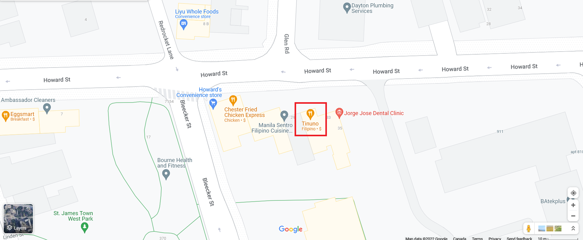
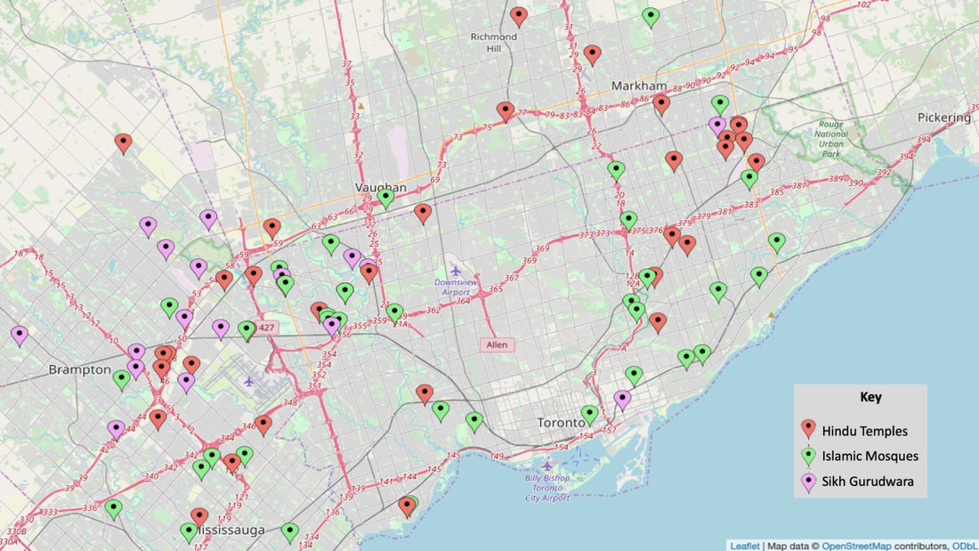
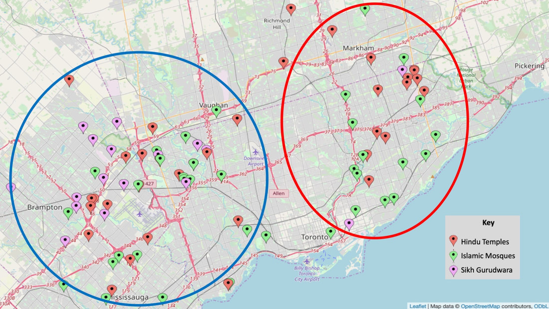
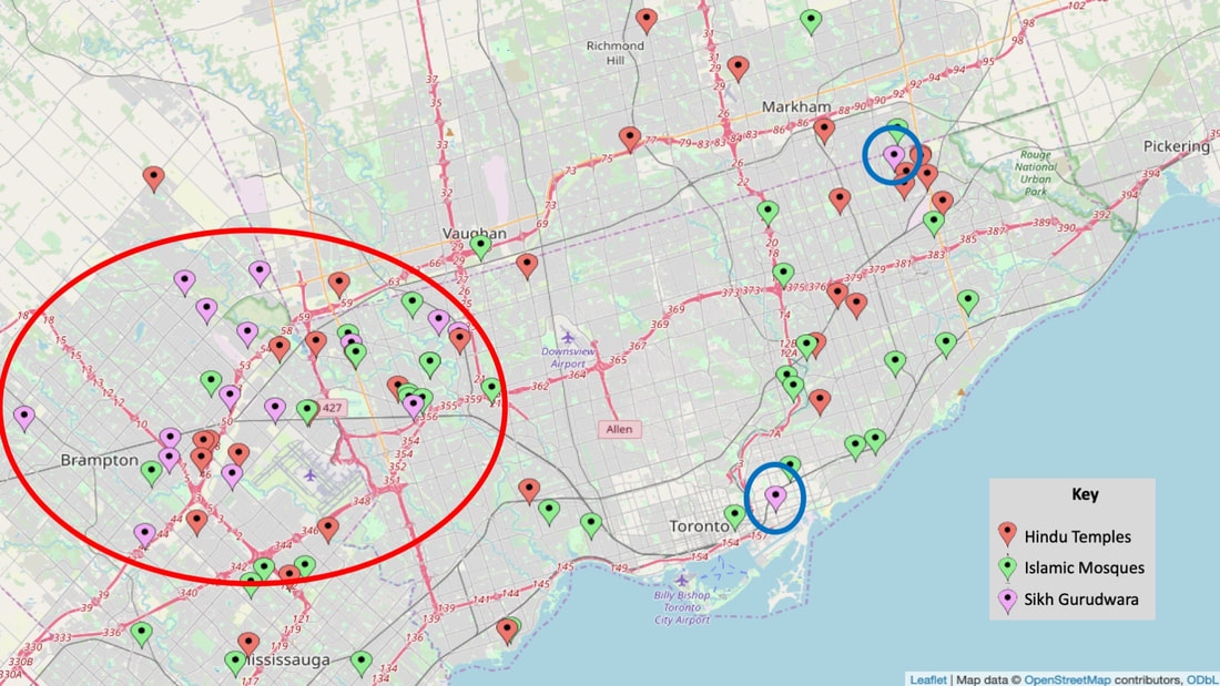
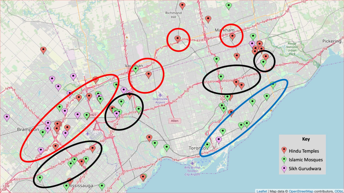
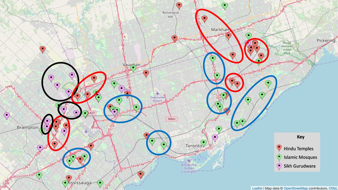
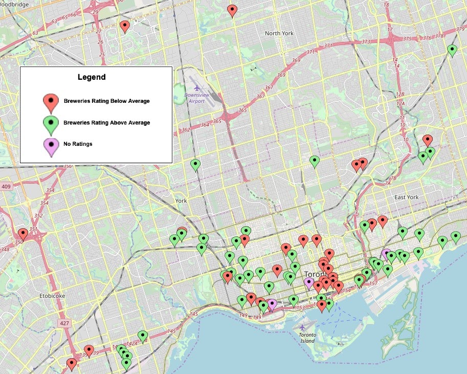
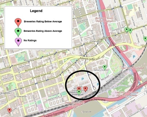
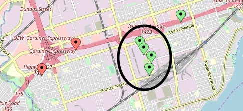
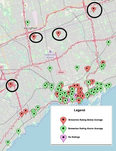
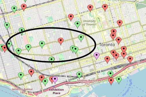
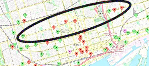
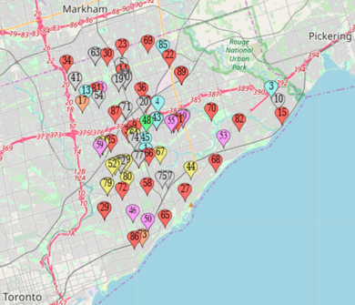
Introduction Toronto holds the title for being Canada’s most populated cities, as of 2022, the total population for the Census Metropolitan Area (CMA) is just over 6 million (City of Toronto, 2023). In the GTA alone, roughly 320,460 individuals are between the ages of 15 – 24. When you think, “Toronto”, most think, “diversity” and this holds true as 51% of Toronto’s population are born outside of Canada and are a part of a visible minority group. Toronto is highly diverse, highly populated, and holds unique clusters of neighbourhoods with specific characteristics and needs. We want to examine what policies and supports are in place to meet the needs of such a fast-growing and dynamic city. To examine this, we focus on recreation and community centers in the City of Toronto. Community centers are important for fostering a sense of belonging, community, civic engagement and enhancing the quality of life for residents. These spaces are multi-purposeful, they provide a range of activities and services from recreational activities, community gathering and other programs and services to meet the needs of its local community. We aim to find whether there is a connection between where recreation/community centres in Toronto reside, why they exist in certain areas, or the absence of a community and recreation centers in other parts of Toronto. Toronto holds 158 social planning neighbourhoods, each with its own history and complex blend of social, physical and psychological characteristics that have prominent effects on its residents overall well-being. That being said, are community and recreation centers strategically placed throughout the city for all neighbourhoods? Or do some areas have more than others? If so, why? We hypothesize that more recreation and community centers reside in areas with greater proportion of underrepresented groups, (e.g., immigrants, visible minority, or youth), and greater level of income inequality within neighbourhoods or boroughs. For this analysis we are only focusing on income distribution and the concentration of youth across Toronto. MethodologyFor our map, we first chose to define Toronto on a smaller scale. Our map does not include the Greater Toronto Area (GTA), instead focusing only on the City of Toronto. This includes Scarborough, Downtown Toronto, East York, North York, York, and Etobicoke. This was done to gain a good spread of the city from the east to west end, and to capture more urban areas rather than suburban neighbourhoods, say pickering, for example. The data points for our map were sourced from Google Maps, through a search for “community and recreation centres in Toronto”. This was applied for all the boroughs listed above. We also search the City of Toronto’s website for a list of community and recreation centres. We chose to examine both community centers and recreation centres as the only difference between the two is that the latter has a slightly more recreational purpose, versus a more social one that a community centre offers. The map is colour-coded based on the title of the organization. If an establishment had only the word “community” it was red; both “community” and “recreation” in the title, it was categorized as purple, only “recreation” in the title was categorized as blue, and if it had neither term, it was considered “other” and mapped as green. This was done simply to enhance the optics of the map. Our map did not include any senior focused centres and did not include the YMCA, we also excluded any community or recreation centre listed on the City of Toronto’s website that is now closed. Going forward, for the spatial analysis we will refer to all community and recreation centre’s as “Centres” Spatial Analysis 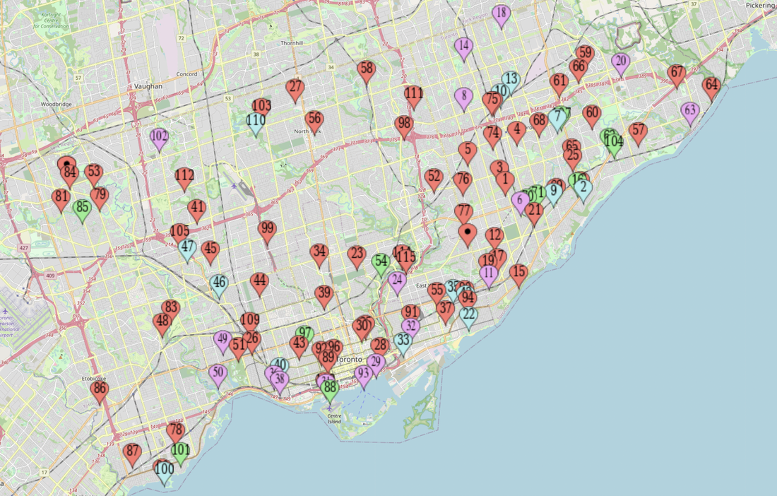 This map reveals a total of 115 Centres spanning across the West to East end of Toronto. We predicted that majority of community and recreation centres would reside in Downtown Toronto and the east end of the city, specifically Scarborough. Our results below, hold our predictions true. The further out you move from the core of Toronto, the sparser the Centres become. Our immediate observations find that there is minor clustering present in the downtown region and Scarborough region of Toronto. Centres that describe themselves as “recreation” only in title, are evenly distributed across the city. There is a large gap in the centre of the map near the north and east York region. We further explore what may explain this gap. An immediate notice on our map is that the distribution of centres takes on a wide “U” shape across the city. With a large absence in the top centre above the downtown area, close to North York. Clusters form near East York and Scarborough Village, and in the downtown region. To examine further we first looked at income distribution across the city to see whether there is any connection between where Centres reside and income distribution. 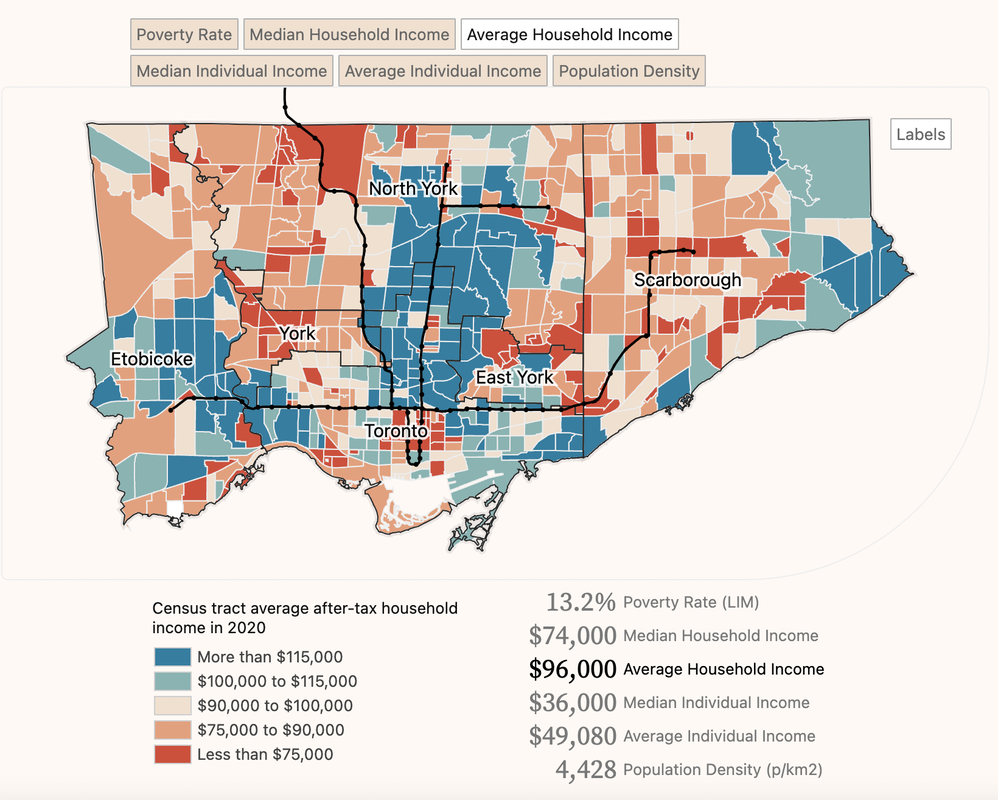 Figure 1: Average household income across Toronto. As displayed on the map above, we compared our map with a map that examines the Average Household Income distribution across Toronto (Figure 1) and the Average Individual Income (Figure 2). In Figure 1, the red shading highlights Average Individual Incomes less than $75,000 and the shades of blue represent an income of $100,000 and above. The three main areas that have a large coverage of blue are at the centre of Toronto, near North York, the very east of Toronto, Pickering, and the very west of Toronto, Etobicoke. In Figure 2, the red shading represents an average individual income of about $50,000 and less, with the beige representing $50,000 to $65,000. 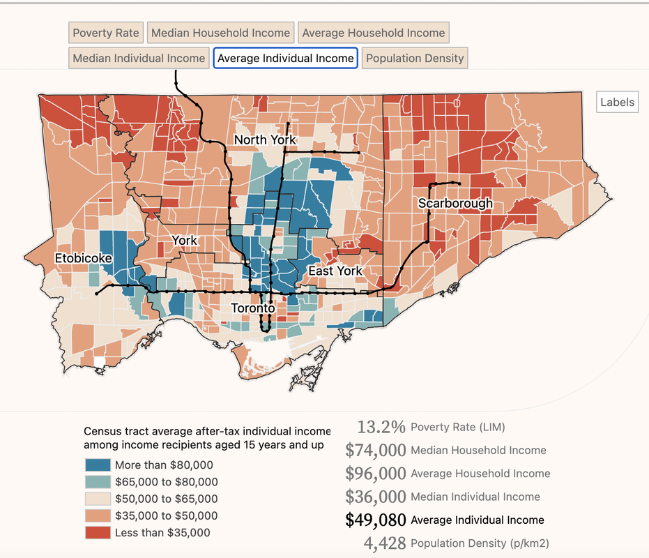 Figure 2: Average individual income across Toronto 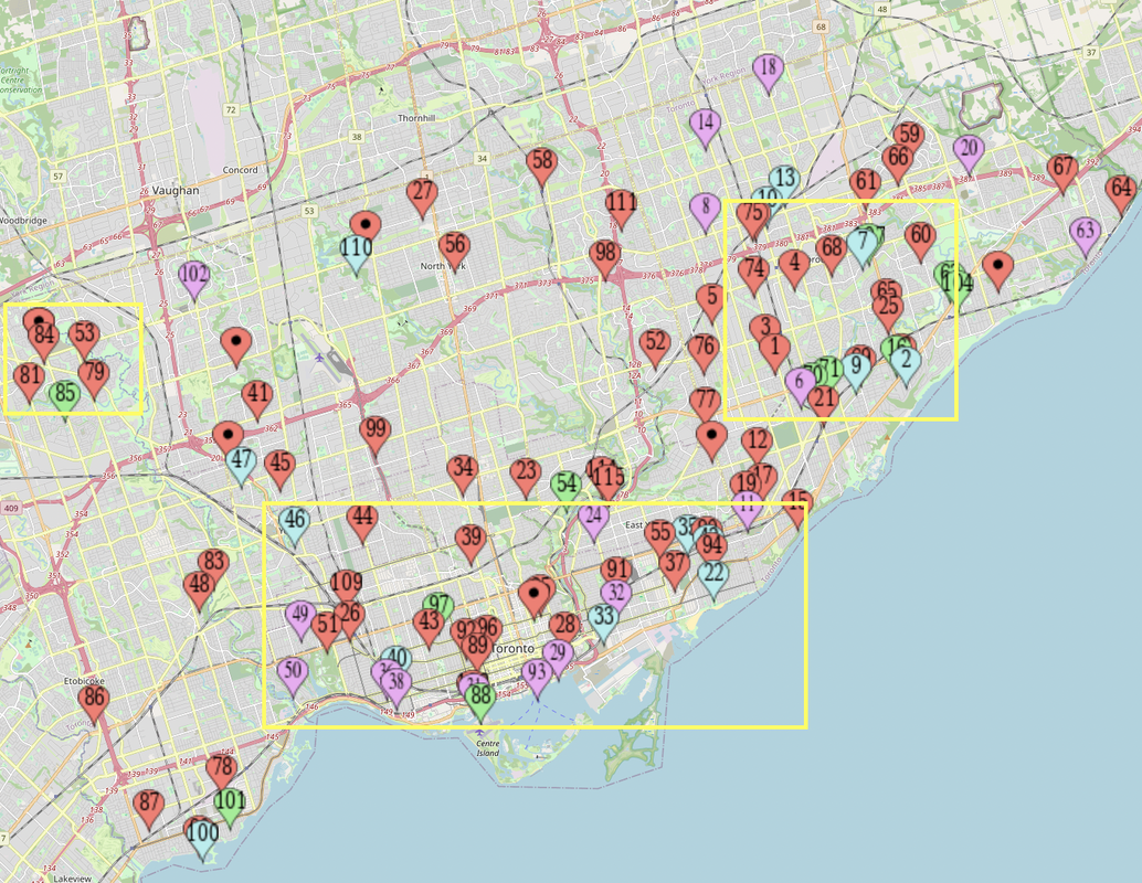 Figure 4: Boxes represent the minor clusters formed The three yellow boxes on the map above (Figure 3) represent the three minor clusters we identified from our map. The sparser areas located outside of the map coincide with the blue shading from the map above. Although this pattern is present, we do not know for certain if the two are correlated, rather it is a surface-level observation. Additionally, the three clusters identified below align with the general concentration of where individuals with lower incomes reside. We now wonder if these Centres were strategically placed in areas where individuals may require further support or resources. When comparing all three maps, a pattern does exist that supports our predictions on Centre placements. The clustering of Centres tends to be in areas with lower income levels, for example Scarborough Village, and interestingly, at the corner west of North York and above Etobicoke, an area we did not predict. 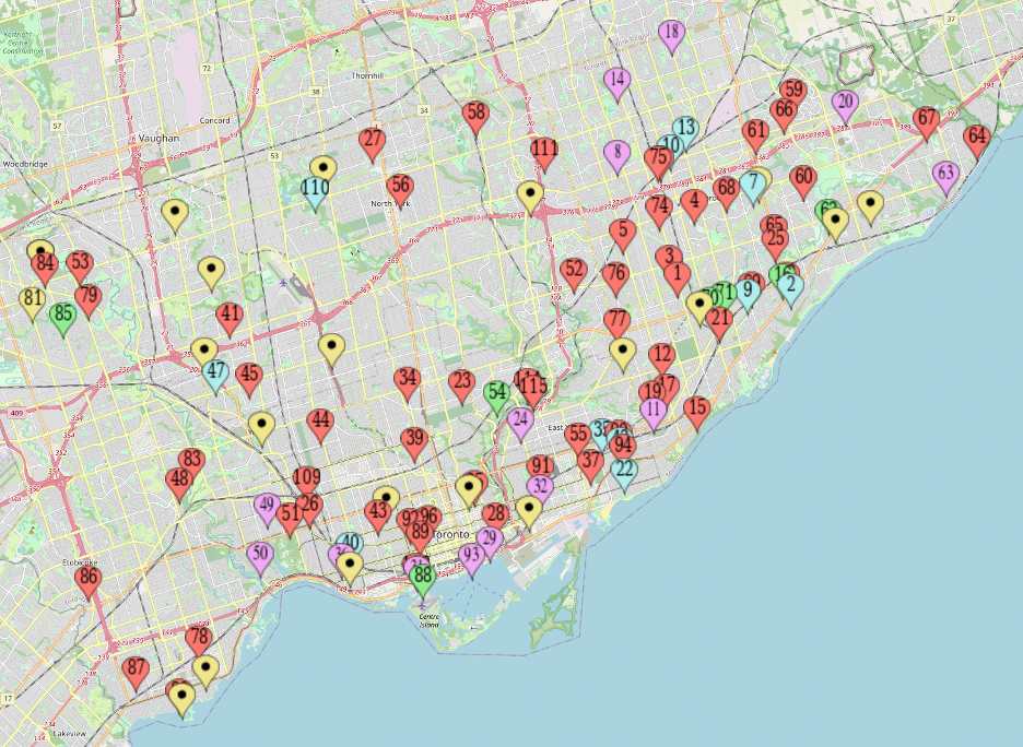 Figure 5: Yellow dots represent Enhanced Youth Spaces (EYS). Figure 5 presents Centres that provide Enhanced Youth Spaces (EYS), as defined by the City of Toronto’s website, these spaces are open to youth five to six days a week, the spaces include Wi-Fi, gaming, TV, pool tables, foosball tables, study spaces, activity labs such as photography, barbering, hairstyling, DJing, yoga, nails, and the like. These programs are offered in several Centres and are mapped in the yellow dots. While they are evenly spread out, they do cluster more in the west and southwest end of the city. In the east end they are within the Scarborough village cluster where majority of the Centres reside. 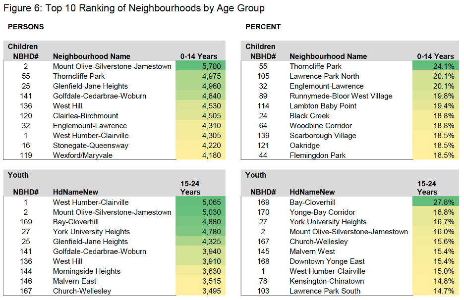 Figure 6: Population distribution by age and neighbourhoods across Toronto To further examine why these Centres and EYS are in specific areas we looked at the concentration of youth aged 15 – 24 years old across Toronto neighbourhoods. The figure below identifies Bay-Cloverhill, Yonge-Bay Corridor and York University Heights as the three areas with the highest percentage of youth. 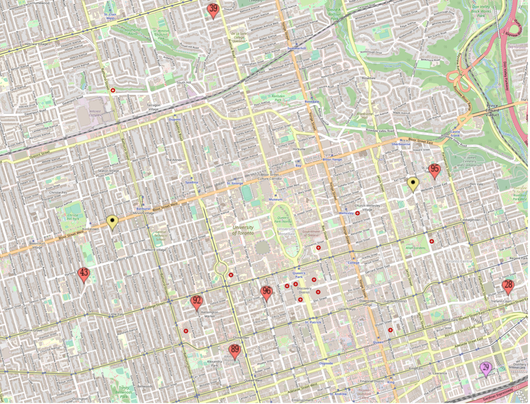 Figure 7: a closer look at the Bay-Cloverhill and Yonge-Bay Corridor. This is near the heart of downtown Toronto The map above describes the Bay-Cloverhill and Yonge-Bay Corridor, this area alone has a good variance of Centres, evenly spaced out, and includes two Centres that run EYS. The map below represents the following neighbourhoods: York-University Heights, West-Humber Claireville, and Mount Olive-Silverstone Jamestown and while, again, sparsely distributed, the neighbourhood includes four Centres offering EYS and on the west of it multiple Centres within a close proximity from one another. It’s important to note, however, that some of these neighbourhoods are also in close proximity to a university, this may explain the higher percentage of youth residing in these neighbourhoods. 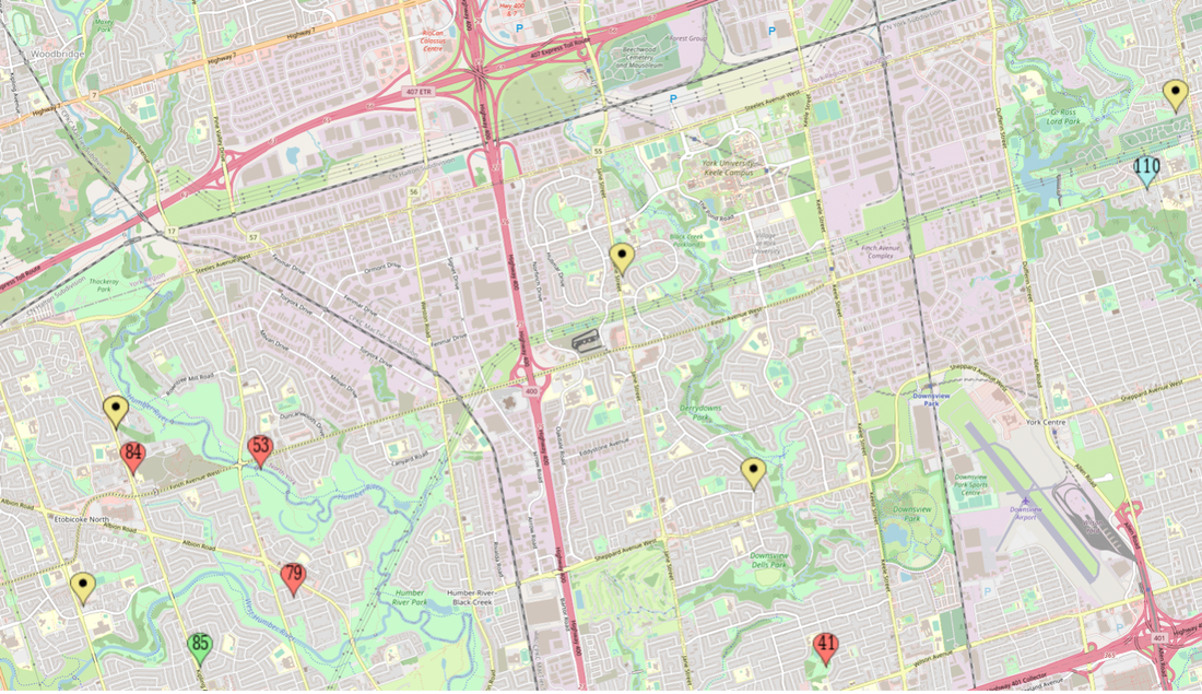 Figure 8: Zoomed in on the Northwest end of Toronto, highlighting the Lawrence Heights and nearing neighbourhoods Conclusion Our spatial analysis examined community and recreation centres across Toronto, and its relationship with income distribution, and concentration of youth across the city. The areas of Toronto with a higher number of community and recreation centre were Scarborough, Downtown Toronto, and some pockets in North York. with respect to income distribution, we found that areas where average individual income and average household incomes were lower ($50,000 and under) there were more community and recreation centres present. There are spaces across our map with little to no Centres present, these areas tend to be neighbourhoods with higher income distribution, for example the Bridle Path community. There are almost no community centres in or around that neighbourhood. One final map we would like to explore in our conclusion is another map that represents the location of average incomes throughout Toronto. Earlier we analyzed a map representing average incomes in 2020, the map below represents neighbourhoods that have an average income a certain percentage above the census metropolitan average (CMA). Very high and high incomes represent having an average income 40% and 20 – 40 %above the CMA, represented in blue stripes. Very low and low income is represented by the opposite, these neighbourhoods have an average income that is more than 40% below the CMA, or 20 – 40% lower than the CMA. The trends for the map shown in Figure 9, and the one representing the 2020 averages (Figures 1 and 2) are similar. There is a slight decrease in wealthier neighbourhood/individuals in the map representing 2020. What would be interesting to further investigate is the distribution of Centres across Toronto in 2000. Would we see similar trends? Would they be spaced out the same way our map indicates? Food for thought Another possible explanation for the trends is the role of government. While a neoliberalist form of governing took wave in the early 1980s, political power does greatly affect the existence of the Centres and its location. Ontario was governed by the Progressive Conservative (PC) between 1995 and 2002 and shifted away from a neoliberal approach of governing. Dramatic cuts were for welfare benefits, there was a reduction in social service workers, and an altogether rearrangement in municipal and provincial power and fewer social services. We can assume that we would therefore see fewer Centres across the city at the time, with more introduced when Ontario was under a Liberal government Funding for Centres are not easy to attain and must be worth the investment. What makes Lawrence Heights more in need of multiple community centres than bridle path? Is it wealth, like what we investigated? Proportion of youth? Immigration levels? crime rates? All of these are possible explanations for why more Centres are present in certain areas in comparison to others and require further research. 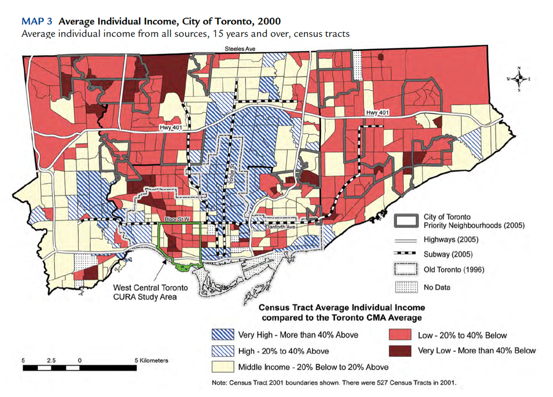 Figure 9: Map representing the Average individual income in the City of Toronto from 2000 Citations Allen J. (2002). Wealth inequalities and poverty concentration in Toronto. School of Cities. City of Toronto (2023). Association of Community Centres. City of Toronto (2023). Youth & Recreation. David Hulchanski, J. (2007). The Three Cities within Toronto: income polarization among Toronto neighbourhoods, 1970-2000. Centre for Urban & Community Studies. Siciliano, A. M. (2010). Policing poverty race, space and the fear of crime after the Year of the Gun (2005) in suburban Toronto (Vol. 72, Issue 7). ProQuest Dissertations Publishing. City of Toronto (2022). 2021 Census: Age, sex at birth and gender, and type of dwelling. https://www.toronto.ca/wp-content/uploads/2022/02/92e3-City-Planning-2021-Census-Backgrounder-Population-Dwellings-Backgrounder.pdf By: Zohal Qadir, Hoasheng Shang, Aditya Shiv Talwar, Sinim Kokhar, Michael Goday, Mengting Fan
0 Comments
Introduction In Canada, Toronto is most known for its diversity. The city hosts many different ethnic backgrounds worldwide, resulting in various types of foods and expansive cuisine. Our interest in the topic of restaurants came from our collective love of diverse food and cultural markets. Based on the wide diversity of restaurants in the city of Toronto, we hoped to find the multitude of similarities and differences of the cuisines offered in the Greater Toronto Area that would explain the rationale for the most expensive and cheapest food. Our goal is to examine why restaurants exist in specific locations with certain thresholds of what constitutes expensive and cheap in the city. As well our spatial analysis is key to determining why or why not restaurants cluster together in spatial locations. Our hypothesis was that based on spatial location, more expensive restaurants would be located in the downtown area and that cheaper restaurants would be spread out more sporadically across the GTA. Methodology The collection of our research data was conducted using the web applications of Yelp and blogTo. We used the filter of dollar signs of the lowest on Yelp being one dollar sign for the cheapest and the highest being four dollars signs for the most expensive for selecting restaurants, as well as using the reviews on the site to indicate that the restaurants were either cheap or expensive, these were our two metrics used. We continued to cross reference our research through the website of blogTO that confirmed the top ten cheapest and expensive restaurants in the city that indicated similarities between both sites being used that restaurants being expensive or cheap were listed as the same based on the price and ratings. Thus this verified that our metric for distinguishing expensive versus cheap restaurants were comparable on both the web applications of Yelp and blogTO. Additionally, we used the top rated reviews on each yelp review to confirm if the ratings were objectively expensive or cheap.We then decided to compile the top 100 restaurants using the metrics of price and ratings to make our list of both types of restaurants in the city of what we constituted an establishment to be generally cheap or expensive on our scale. With Toronto being the most populous and diverse city in Canada it made sense to set our boundaries with our research within the GTA strictly. In terms of defining what the Greater Toronto Area is, we focused on the Peel Region, York Region, Durham Region, and City of Toronto. To be more specific about these regions when looking at our maps, we found that there were a lot of expensive and cheap restaurants in Downtown Toronto, Scarborough, Markham, and Mississauga. This is how we narrowed down our selection process for the restaurants in our research. With our 100 restaurants now picked, 50 are labeled as expensive and the other 50 are labeled as cheap. They are distinguishable based on colored markers on the map. The top 50 expensive restaurants are marked by the color green, and the top cheap restaurants are marked by the color red. Most Popular Expensive vs Cheapest Food in Toronto Analysis The data results reveal that the most popular restaurants are located in downtown Toronto. We initially made the assumption that spatial location would differ based on cuisine and price range, but our hypothesis was incorrect according to our set of cases which consist of 100 restaurants. Of the 100 restaurants, 50 were the popular expensive restaurants and the other 50 were the popular cheap restaurants. Cheap & Expensive ( Green = Expensive, Red = Cheap ) 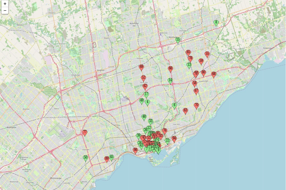 Our maps showcase the sporadic but mostly limited markers of restaurants that cluster in downtown Toronto. We were able to narrow down in our spreadsheet the top types of restaurants in the expensive category being Steakhouses, Italian, and Canadian cuisine; with the top types of restaurants in the cheap category being Chinese, Mexican, and Korean cuisine. There could be many factors that contribute to the reasoning for a cluster of restaurants in Downtown. Downtown Toronto is known to be the home of many tourist attractions, social spots, and festivals, which draws large crowds. Restaurants benefit from the marketing and media attention that all of these attractions produce.The larger crowds increase the chance of more customers leaving positive reviews for restaurants. The attractions and diversity of downtown creates creative locations and themes for restaurants which also bring business, ranking them as the most popular restaurants in Toronto. Map of Cheapest Restaurants  The picture above shows the 50 cheapest restaurants located in the GTA. Although we included boundaries in the GTA, some restaurants are spread out while most are located downtown Toronto. As pictured, the layout of this map showcases that cheaper restaurants seem to be slightly more spread out in the GTA, with some restaurants being closer to Markham, Vaughan, and Mississauga. But the majority of the restaurants cluster in downtown Toronto with a wide range clustering in the Scarborough East York region. Map of Expensive Restaurants 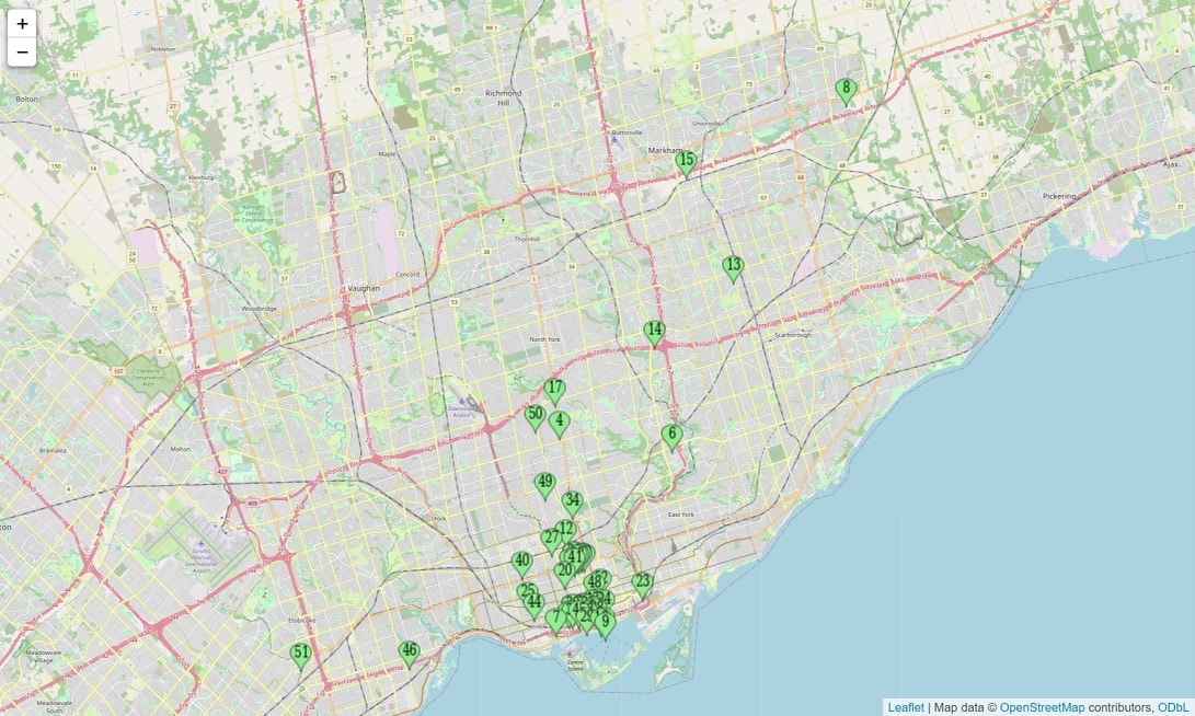 The picture above shows the 50 most expensive restaurants located in the GTA. Although we included boundaries in the GTA, most restaurants are spread out in downtown Toronto, with some outliers in other regions. As pictured, the layout of this map showcases that expensive restaurants seem to be slightly more spread out in the city of Toronto, with some restaurants being closer to North York, Etobicoke, Scarborough and Mississauga. But the majority of the restaurants cluster in downtown Toronto highlighting our original hypothesis that spatially more expensive restaurants would cluster in this area. Looking back at these three maps, we can see the influence of the culture theory. Culture theory is a rhetoric that explains the way in which markets work because they are backed by social beings, and it promotes development in group relationships over individualism. A key part of this theory is that there is a focus on contexts and value systems and how economies are strengthened by larger cultures in which they are located. Essentially taking away ethnocentric bias from an individual's cultural conditioning. The relation to our research area is that the way in which Toronto’s demographic is broken up in socioeconomic status, race, and ethnicity has direct correlation to the cluster of where restaurants are located and which types of restaurants make up the majority in certain regions. Culture theory explains the importance of individuals in a society who have their individual ideas, beliefs and values. Social beings have a large influence when it comes to markets and they function. This theory evaluates how certain situations are related to ethnicity, social class, gender, etc. It also helps us understand and minimize ethnocentric bias from one's conditioning. In relation to our research, it helps us look at our own perceptions of cultural conditioning when we look at where these restaurants are located. We’re paying attention to different group environments and their cuisines that are spatially located in specific areas, whereas expensive food could be located in just one area. Culture clusters is another theory that this research sheds light on. Culture clusters occur when an environment or small area is populated with restaurants, shops, or infrastructures that incorporate a common theme or culture. When analyzing the location of the cheapest restaurants we found that many restaurants of similar and diverse cuisines were located near one another, outside of the Downtown core. Culture cluster theory suggests that these clusters assist business to gain attention by creating a familiar environment for communities that identify with that culture;this would explain the spatial analysis and give reason to why certain types of restaurants of different prices and ethnic cuisines are spatially located more so in specific areas. The restaurants that are clustered together may have gained popularity through culture clustering as they do not have the luxury of lively crowds constantly flowing through downtown. This information would be useful to understand the importance of creating familiar environments for people of different ethnicities or passions. Other examples of culture clustered are little Italy, Chinatown, the distillery district which represents culture of the arts.We predict that the culture cluster of restaurants located outside the downtown core may be in the beginning phases of becoming well known culture clusters such as these. Concluding Thoughts Through our spatial analysis and the observation of our research we were able to find that our hypothesis was true that we were able to find more expensive restaurants clustered mostly in downtown Toronto, with cheaper restaurants having a more sporadic spatial analysis in the GTA. In relation to our theories of culture and cluster we were able to discern relations of cultural significance in the spatial locations of the restaurants in our research. We believe that these different types of restaurants across the GTA have an impact on the cultural markets and its competition. As shown in the Cheap & Expensive map, a lot of different types of restaurants reside in the City of Toronto downtown area. Since downtown Toronto is a high tourist attraction, restaurants adhere to the competitive market and do what's best to meet the culture diversity. References: Avilés Ochoa, E., & Canizalez Ramírez, P. M. (2018). Cultural Industries and spatial economic growth a model for the emergence of the creative cluster in the architecture of Toronto. City, Culture and Society, 14, 47–55. https://doi.org/10.1016/j.ccs.2018.03.001 Best+Cheap+eats Toronto, on - last updated September 2022. Yelp. (n.d.). Retrieved September 2022, fromhttps://www.yelp.ca/search?find_desc=best%2Bcheap%2Beats&find_loc=Toronto%2C%2BON&attrs=RestaurantsPriceRange2.1 Fine+Dining+restaurants Toronto, on - last updated September 2022. Yelp. (n.d.). Retrieved September 2022, from https://www.yelp.ca/search?find_desc=fine%2Bdining%2Brestaurants&find_loc=Toronto%2C%2BON&attrs=RestaurantsPriceRange2.4&start=10 Searching within restaurants for best+cheap+eats Toronto, on. Yelp. (n.d.). Retrieved September 2022, from https://www.yelp.ca/search?find_desc=best%2Bcheap%2Beats&find_loc=Toronto%2C%2BON&attrs=RestaurantsPriceRange2.1&cflt=restaurants Serrat, O. (2008). Culture theory. Knowledge Solutions, 22–24. https://doi.org/10.1007/978-981-10-0983-9_7 Staff. (2018, August 5). The 10 most expensive restaurants in Toronto. blogTO. Retrieved September 2022, https://www.blogto.com/eat_drink/2014/01/the_10_most_expensive_restaurants_in_toronto/ Submitted By:
|
 A map showing a zoomed-out, broader view of bakeries in Scarborough. Included to illustrate where Scarborough is in relation to it's surrounding, neighbouring areas of Toronto (downtown), Markham, and Pickering. | 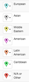 Our legend used to differentiate between our seven categories of national origins of bakeries. |
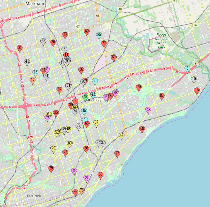
A closer, zoomed-in illustration of the map of bakeries in Scarborough.
Spatial Analysis Results
Overall, one of the most apparent observations from taking a look at the map is the noticeable sparsity of bakeries in the East-end. Whereas the rest of Scarborough has a relatively consistent and even distribution of bakeries, the East-end only has a few. We hypothesize a few reasons for this. Firstly, it is likely that the further away from the downtown Toronto core, the less populated areas are, and thus fewer businesses. Secondly, much of the north-eastern part of Scarborough consists of forests with fewer residential and urban communities. Thirdly, we hypothesize that there are not many bakeries near the waterfront because much of the waterfront on the East-end of Scarborough contains public parklands and is not very built up. Therefore, there our boundaries are made due to the fact that there are not many businesses in this location.
In terms of clusters evident on the map, one of the most noticeable observations is the cluster of Middle Eastern bakeries (identified in yellow) near the major intersection of Lawrence Avenue East and Birchmount Road. Interestingly, all nine Middle Eastern Bakeries included in this analysis are located in this particular area. It is possible that this area is home to a high proportion of Middle Eastern residents and this is something that we could look more into in the future.
Also worth noting is the presence of Asian bakeries located in northern Scarborough as well as along Kennedy Road and Midland Avenue. One reason for this could be that located in the centre of the marked Asian bakeries on the map lies one of Toronto’s main Chinatowns. The Chinatown referred to here is located around the major intersection of Sheppard and Midland.
In examining how the seven different categories of bakeries compare with each other in terms of quantity, we see that there are many Asian, American, Middle Eastern, and European bakeries and a smaller amount of Latin American and Caribbean bakeries. It is also clear that there are many bakeries that do not state a clear national origin. These bakeries (the ones indicated in red) may be excluded in future research in order to focus more on bakeries with clearer national origins. Overall, the map gives us an insight as to where bakeries of certain national origins are located in Scarborough and this spatial distribution analysis can help researchers begin to examine why the bakeries are located where they are.
Future Directions
Our group intends on using Richard Florida's article "Cities and creative class" in order to understand our geographical location from an economic perspective. Florida argues that economy is tied to concentrations of people (Florida, 2003, p. 4). To illustrate, it is important while filtering Scarborough in the seven categories that our research does not reflect idealization like in Florida's creative class. Our future direction would include investigating speciality bakeries and their economic relationship geographically depending on the number of stores per a category. An example of a category to focus on would be Middle Eastern bakeries as our spatial analysis confirmed a clustering of this category in Scarborough. Moreover, our group intends to integrate Robert G. Hollands understanding of labels in "Will the real smart city please stand up? Intelligent, progressive or entrepreneurial" in the ways labels have hidden assumptions and contradictions (Hollands, 2008, p. 303). A limitation of our research is one of our seven categories is known as other. This is a potential disadvantage of an other label is identifying it's authenticity regarding origin. A strategy our group has is using Matt Patterson and Daniel Silver article "The place of art: local area characteristics and arts growth in Canada" in order to compare Scarborough's geographically condensed landscape in terms in terms of urbanity and gentrification (Patterson and Silver, 2015, p. 69). Thus, our groups future intention is to understand the other categories level of authenticity by relating it to ideas of globalization fusions. Specifically, how a condensed landscape allows for an understanding of a condensed bakery that includes a variety of specialities. Tommy Wu in "The Resentful Foreigner: Racializing Chinese Workers in Asian Fusion Restaurants" acknowledges that this category emphasizes "spaces of encounters" that identifies a racial stereotypes and attitudes towards racial identities (Wu, 2019, p. 59). In the future our group is interested in including background information towards the racial attitudes and stereotypes historically tied to these categories in order to truly understand how their authentic title is situated geographically.
Conclusion/Overall Thoughts
In conclusion, the location of Scarborough makes for a productive analysis as there are a variety of bakeries that fall into the seven categories of European, Asian, Middle Eastern, American, Latin American, Caribbean and Other. Geographically, Scarborough has a condensed landscape regarding bakeries and therefore provides compelling data in regards to its diversity and inclusion of the seven categories specialities. The bakeries have been found on Yelp in which 90 bakeries were chosen within the "recommended" filter to emphasize the existence of the seven categories. An advantage of researching bakeries in Scarborough is that Scarborough’s landscape condenses many stores into one area therefore making it easy to find a diverse number of bakeries in this area. As we noticed from the spatial analysis there is an even distribution of bakeries in Scarborough. In addition, our group noticed a clustering of Middle Eastern bakeries. Moving forward our group seeks to understand this condensed populations economic relationship with Middle Eastern bakeries. Our group hypothesizes that the number of bakeries near the waterfront is low because of how much of the waterfront on the East-end of Scarborough contains public parklands and is not developed. In addition, our boundaries are made due to the fact that there are not many businesses in the surrounding geography that is public parklands. A disadvantage is that many bakeries do not officially identify with a category. Moreover, our group will overcome the limitation of a bakery's lack of identification with a category by putting these bakeries in an other category that in itself has its own value. Therefore, our group will need to acknowledge the level of authenticity of the label associated with the other category. Our group will engage with literature to acknowledge this other categories associated authenticity the ideas of globalization and fusion. In conclusion, our group is interested in investigating the ways authenticity is communicated through these seven categories and how Scarborough’s condensed landscape emphasizes categories over others.
Work Cited
Florida, R. (2003). Cities and the creative class. City & Community, 2(1), 3-19.
Hollands, Robert G. (2008). Will the real smart city please stand up? Intelligent, progressive, or entrepreneurial? City 12(3): 303-320.
Patterson, M., & Silver, D. (2015). The place of art: Local area characteristics and arts growth in Canada, 2001– 2011. Poetics, 51, 69-87.
Wu, T. (2019). The Resentful Foreigner: Racializing Chinese Workers in Asian Fusion Restaurants. Journal of Asian American Studies 22(1), 59-78
Bernardo, Julia, Lindsay, Tiffany
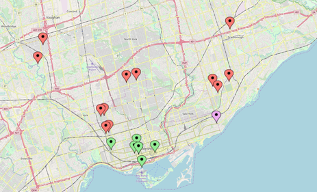 Figure 1: Toronto Marijuana Dispensaries
 Introduction
Legalization of recreational usage of Marijuana has been popular topic of discussion with many polarizing views, since it was enacted on October 17th, 2018. The culture surrounding the leisurely use of marijuana has grown exponentially over the last century, with its usage becoming very popular among youths and adults. For our research, all of us agreed that we wanted to approach a contemporary topic. With marijuana usage becoming normalized and the potential for the marijuana industry to grow greatly in the years to come, we decided that understanding where dispensary storefronts are spatially located could help us understand the culture of recreational use of marijuana.
Since marijuana dispensaries had been limited to medical consultation centers and illegal storefronts prior to the nationwide legalization, it was difficult to study patterns of spatial clustering of these stores. However, since we have seen the emergence of new storefronts, it is possible to begin studying how recreational marijuana usage is linked to urban density, and what that indicates about urban populations. Through the spatial analysis, we hope to see where recreational storefronts are located across Canada's five largest cities (by population - Toronto, Montreal, Vancouver, Calgary, Edmonton), and examine whether suburban areas or urban regions attract more clustering and generally higher number of marijuana dispensary locations. Through this, we want to understand whether marijuana storefronts are densely located in urban centres because of an ‘urban’ culture or high population
Methodology
To analyze the distribution of marijuana dispensaries in the five cities that we have selected, we had to narrow down the scope of retailers to storefronts, as delivery services and other forms of marijuana retails would not be sufficient in telling us how urban density influences the spatial distribution of these services. Distinguishing and locating the storefronts was made easy through the use of weedmaps.com, which is an online database of marijuana dispensaries, that allows users to locate dispensaries in numerous cities via an interactive map, and also share reviews on the website with other website visitors. Their intuitive platform made it easy for us to observe their geographical setting, which was crucial for figuring out where the clustering of these storefronts were happening.
In the case of Montreal and Edmonton however, Google maps was also used to gather data, because certain dispensary storefronts were not listed in the Weedmaps database. This discrepancy between the Weedmaps listing and results from other search engines was not found to a large degree in the case of the four other cities that we looked at, but we cannot overlook this oddity, as it could suggest that there is a limitation to our search methods, as there are inevitably some dispensaries that have not listed their business on these databases for various reasons, potentially for legal reasons.
We selected the five cities mentioned above, for they rank the highest in Canada, in terms of population sizes. Population size can be utilized as a control variable to investigate whether it is the sheer number of residents living within city boundaries that attract clustering of marijuana dispensaries, or if the matter simply comes down to the urban culture of these different cities. The varying levels of density within these cities will allow us to analyze how the control variable of population size can alter the patterns of spatial clustering of marijuana dispensaries.
The areas selected as "urban" and "suburban" were selected based on the official boundaries provided by the municipal governments of each cities. Urban areas were designated to the regions defined as "downtown". Searching for the downtown boundaries of each city on Google maps allowed us to distinguish the urban region from the suburban region, which we chose to be the remaining regions within the city boundaries, outside of the designated downtown.
The main limitation to this approach is that by restricting urban areas to the designated downtown regions, we are overlooking densely populated neighborhoods which are located outside of these regions. This includes Toronto's Liberty Village and Trinity Bellwoods communities, Montreal's Old city and The Plateau, Vancouver's West end, Calgary's Belt line, and Edmonton's Oliver neighborhood. Going forward, we will address this issue by using population density as the measure for urbanity, rather than going by the limited definition of downtown regions.
To illustrate whether the dispensaries were located in urban areas of the cities or in the suburban regions, we used color coded plots for each of the stores. Green plots were selected to indicate that these stores were located within the designated downtown regions, while red plots were selected to indicate that these stores were located within the areas we defined as "suburban". An additional pink dot was included to indicate where upcoming storefronts will be located, to observe where future developments will be clustering around.
Spatial Distribution
Legend:
Green pin- Downtown Storefront
Red pin- Suburban Storefront
Pink pin- Opening Soon
Toronto
After spatial analyzing the distribution of marijuana storefronts that are currently operating in the City of Toronto in comparison to other major cities around Canada our data collected shows an existing 19 marijuana storefronts with 1 retail storefront upcoming April, 2019 according to the Ontario Cannabis Store which will be the first legally opened cannabis storefront that will be operated by the City of Toronto. Another significant finding from the spatial mapping of marijuana storefronts in Toronto show evidence of clustering of marijuana dispensaries situated in close proximity of one and other in the downtown core of the city. This can be due to the fact that the City of Toronto's downtown core being very densely populated. The trend of spatial clustering continue to extend from the downtown core to an extent as the suburban neighbourhoods surrounding the downtown core also show evidence of clustering. It seems to us through these findings that when one marijuana store opens there is another in close range.
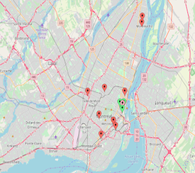 Figure 2: A Look at Montreal Dispensary Locations Throughout the Island
 Montreal
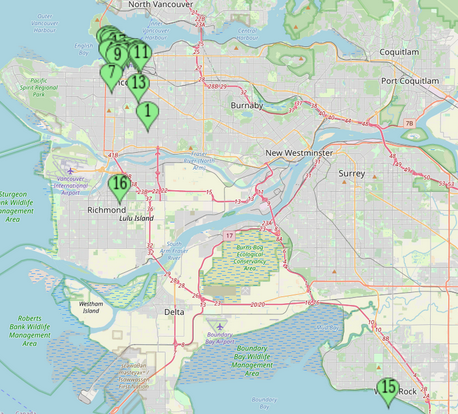
Montreal has multiple dispensaries within the downtown core and throughout the island, two of them being a fair distance away from the city itself. With the singular upcoming location and the many locations throughout Montreal, we can infer that marijuana is highly used throughout population which is dispersed around the core. The city has 1 upcoming and 5 existing storefronts downtown, and 8 dispersed outside the city core. It is also interesting to note that 2/3 of the medical storefronts are the furthers from the downtown core, and 1 is in the centre.
Montreal has multiple dispensaries within the downtown core and throughout the island, two of them being a fair distance away from the city itself. With the singular upcoming location and the many locations throughout Montreal, we can infer that marijuana is highly used throughout population which is dispersed around the core. The city has 1 upcoming and 5 existing storefronts downtown, and 8 dispersed outside the city core. It is also interesting to note that 2/3 of the medical storefronts are the furthers from the downtown core, and 1 is in the centre.
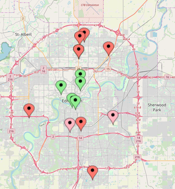 Figure 3: Edmonton Dispensary Locations Based on Downtown Core and Suburbs
 Edmonton
The city of Edmonton has a wide range with thirteen active dispensaries, both recreational & medical, and a steady growth of two upcoming locations in the suburbs. The density of the city tends to be in the downtown core where there is currently a healthy five store fronts selling cannabis, another five directly above the core where two storefronts are so close that they show as a single pin on the map below, and another five spaced out South of the core close to the major highways, possibly to be more accessible and convenient. It is clear by this data, there is an existing downtown core, a possibility of an upcoming nearby secondary core of Edmonton based on established storefronts as cultural evidence, whereas the Southern region is lacking albeit growing in activity.
In order to be able to sell cannabis legally, a store must now source their product through the Alberta Gaming, Liquor and Cannabis Commission at a rate $8.90 per gram which is well above the average cost per gram, currently at $7.67 per gram. With this new standard for wholesale prices about to be put in place, the projected cost per gram may reach up to $12, nearly the full amount of Edmonton's $15 per hour wage. This may cause some dispensaries to close down, or illegal "underground" dispensaries to work within the market, due to lack of sustainability and allow predominantly cannabis franchises to dominate the market since they would be able to purchase at large quantities, saving their margins and the contents of their consumer's pockets. Time will tell how this change in regulation will effect the quantity of storefronts, quality of cannabis product, and method of advertising in the market.
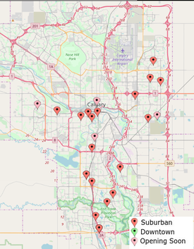 Figure 4: Map of the city of Calgary
 Calgary
A look at the map of Calgary's dispensary distribution reveals that there is indeed a slight amount of clustering occurring around the downtown region. Oddly enough, however, there is not a single dispensary store front located within the designated downtown region. This could be assumed to be the result of the high rates of commercial rent found in the central downtown regions. Instead, the clustering happened mostly around the neighborhood known as the Beltline, which is the city's most densely populated neighborhood, as well as the most urban.
Another form of clustering that we observed in Calgary was the tendency for many of these shops to be located either directly on or off the Macleod trail, a major road running north and south across the city, much akin to Toronto's Yonge Street.
Vancouver
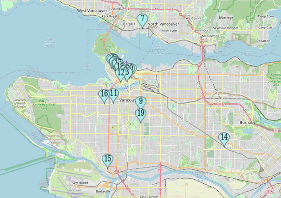
Looking at the weed dispensaries in Vancouver was interesting because most people may think that they are primarily found in a downtown or urban setting, which was the case for many of the dispensaries, however, we found that many of them were also found outside of the downtown area. Out of the 16 dispensaries found in the city, half of them were found in the downtown core and the other half were found in different suburbs. Vancouver is one of the most expensive cities to live in, in North America, and so the clustering of dispensaries downtown has reason to it, as that is where folks with higher incomes tend to reside. What calls for attention here is the fact that half of the dispensaries are not in the downtown core, and so what we may question is why they are spread out rather than just be in one downtown cluster.
The different locations of the dispensaries in Vancouver allowed us to get a further look into our initial question of whether dispensaries are mainly located in urban centers or placed in certain areas because of the high population. What was noticed in the downtown, Vancouver was that there was a lot of clustering of dispensaries (as can be seen by the green pin points), which is a common theme in all 5 cities. Having cities such as Vancouver that have dispensaries available in areas that are not urban based may suggest that dispensaries are now spreading to other areas due marijuana becoming legal. Storefronts for marijuana have been around for some time, however, you would not typically find them in suburban areas. After the legalization of weed in Canada, it is possible for them to be found in other parts of the city. The spacial distribution of dispensaries in Vancouver can be seen as a way of looking into how the legalization of the drug can possibly lead to storefronts widening their locations, and open up shop in areas that are less dense.
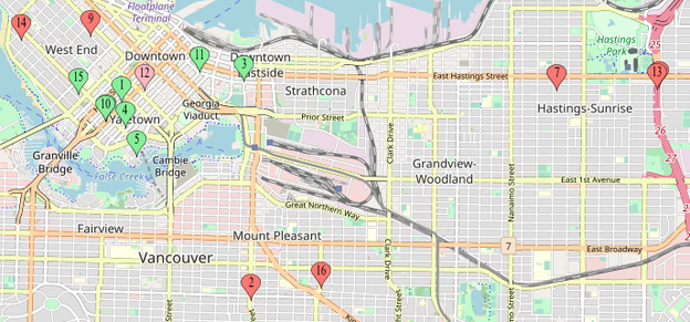
Figure 5: Vancouver Dispensaries in the Core and Suburbs
Conclusion
A collective analysis of the five cities of study confirmed what we hypothesized prior to conducting a spatial analysis: that marijuana dispensaries will tend to cluster around densely populated areas. Businesses, especially retail storefronts, are attracted to the neighborhoods where foot traffic is heavy, which increases the number of potential customers. Plotting the storefronts on maps made it easy to observe where these clustering were occurring. However, these maps alone are insufficient in understanding exactly why marijuana retail storefronts tend to be located in close geographic proximity,as well as why clustering happens in particular areas of a city. Few areas of focus we can look into in the next research steps to come, are the factors of population density and the general demographics of the residents in the neighborhoods where clustering is occurring, and cross analyze the locations with nearby transportation lines such as highways and bus lines, to see if there is a correlation. Understanding why clustering happens in some areas more so than others would provide insight into the culture of Cannabis usage.
Research Assignment By: Irina Ursache, Monish Ghosh, Hanna Kassim, Juveriah Junaid, & Jay Park
Introduction
Our group wanted to do this project on a service that we could all relate to. We thought about food but then couldn’t agree on a specific kind because we had so many varying opinions. That’s when we thought of a service that everyone uses, a service we begin to use when we are in our diapers and continue to use until we are yet again put into diapers. The topic our group decided to investigate were hair salons. Getting a haircut is one of the few services that human beings will always need. The topic first arose when we realized that the male members in our group pay different amounts for the hair cut they receive. One person got their hair cut from Kensington Market for $40, while the other got his hair cut for $55 at Yorkville. We discussed the topic more and came to the realization that this service would be a perfect topic to do this project on. We first set out to determine our scope of what hair cutting services we could be looking into by looking at the viability of looking into barber shops and/or hair salons. We decided to narrow our field of view to just focus on hair salons alone. We then moved on to answer the question of what constitutes as a hair salon, which at the minimum we defined as an establishment in which hair is cut. We wanted to see how this common service varied in prices across different geographical locations, for this we decided to look at hair salons in the Toronto area as well as neighbouring areas such as Newmarket and Brampton. Our goal was to investigate hair salons in different regions, trying to uncover differences in pricing across hair salons and why this appears to be the case. We believe that the key distinction lays in the pricing scheme, wherein the price of a haircut differs between salons based on region. The hypothesis our group puts forth is that changes in location, branding and services are important variables underlying the pricing schemes evident within these salons. We feel that this presents an importance behind the geographical boundaries set out within this spatial analysis. The regions chosen for this study are chosen in an attempt to reflect these differences in pricing and branding, and as such, the boundaries we have chosen should allow for a productive analysis.
Our group wanted to do this project on a service that we could all relate to. We thought about food but then couldn’t agree on a specific kind because we had so many varying opinions. That’s when we thought of a service that everyone uses, a service we begin to use when we are in our diapers and continue to use until we are yet again put into diapers. The topic our group decided to investigate were hair salons. Getting a haircut is one of the few services that human beings will always need. The topic first arose when we realized that the male members in our group pay different amounts for the hair cut they receive. One person got their hair cut from Kensington Market for $40, while the other got his hair cut for $55 at Yorkville. We discussed the topic more and came to the realization that this service would be a perfect topic to do this project on. We first set out to determine our scope of what hair cutting services we could be looking into by looking at the viability of looking into barber shops and/or hair salons. We decided to narrow our field of view to just focus on hair salons alone. We then moved on to answer the question of what constitutes as a hair salon, which at the minimum we defined as an establishment in which hair is cut. We wanted to see how this common service varied in prices across different geographical locations, for this we decided to look at hair salons in the Toronto area as well as neighbouring areas such as Newmarket and Brampton. Our goal was to investigate hair salons in different regions, trying to uncover differences in pricing across hair salons and why this appears to be the case. We believe that the key distinction lays in the pricing scheme, wherein the price of a haircut differs between salons based on region. The hypothesis our group puts forth is that changes in location, branding and services are important variables underlying the pricing schemes evident within these salons. We feel that this presents an importance behind the geographical boundaries set out within this spatial analysis. The regions chosen for this study are chosen in an attempt to reflect these differences in pricing and branding, and as such, the boundaries we have chosen should allow for a productive analysis.
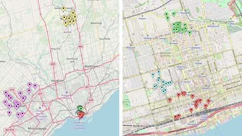
Figure 1: To the left is the map of all the regions selected, and to the right is the map of Downtown Toronto.
Yellow = Newmarket ; Purple = Brampton ; Light Blue = Kensington Market ; Red = Entertainment/Fashion District ;
Green = Yorkville
Yellow = Newmarket ; Purple = Brampton ; Light Blue = Kensington Market ; Red = Entertainment/Fashion District ;
Green = Yorkville
Methodology
Population/Regions
The population being studied consists of hair salons. The method through which this population was defined and discovered was through Yelp. The team defined hair salons as a place that either had the word(s) “hair”, “salon” or both in their business name. Additionally, the team used the category control on Yelp, with “hair salons” being selected as the parameter. This helped us avoid the issue of only receiving results of hair salons that named themselves as such, which allowed us to include places that may have named themselves “studios” or “boutiques.” Essentially, this allowed us to broaden our search for hair salons that did not have the words “hair” or “salon”, but were still categorized as hair salons. The team searched their respective regions for hair salons within Yelp, where the results were filtered by most to least reviewed. The top 15-25 most reviewed hair salons in each respective region were then chosen to ensure accuracy when selecting the hair salons for analysis. This search strategy allowed us to locate hair salons in the regions we specified in a consistent and reliable manner. This had some advantages, with a major one being that we were more confident of the existence of such salons if they had more reviews. Alternatively, the limitation behind this strategy is that we may have missed salons with little or no reviews that may have had potential characteristics that could be revealing of a different phenomenon. However, the intention behind choosing salons in this manner was to find places that were reliable and ones that we knew existed, as opposed to having a hair salon that may potentially not exist. It can also be argued that if the location of a salon has an influence on the pricing scheme within the region, then using a sample of that population should suffice in capturing this effect.
Hypothesis
The hypothesis the group constructed for this study was that hair salons will differ in their pricing based on the primary variables of location, branding and service, with a potential introduction of sub-variables that would become apparent upon preliminary examination of the data. For the purposes of the spatial analysis, the locations were mapped so we could visualize the distribution of hair salons. In regards to finalizing which regions we wanted to explore, there were a number of considerations.
Firstly, we wanted to explore one extreme of the pricing scheme, namely, places where the price of a haircut were more substantial than average. While brainstorming where this might occur, we immediately thought of urban places, such as New York City. Furthermore, we examined and compared areas in Toronto that were similar enough to adopt a similar pricing scheme. This led the group to choosing the Entertainment/Financial District and Yorkville. The rationale behind the former is the importance of fashion and appearance being prominent in that location. This led us to believe that not only would many hair salons be present in this location, but also that they would be on the pricier end, due to the importance ascribed to them as well as the reputation of the location. Our second location of Yorkville was chosen for a similar reason, in that the neighbourhood is among the most affluent in Toronto. The rationale regarding the selection of Yorkville was to also gain insight on a high price point range that could capture one end of an extreme pricing scheme. The two Downtown neighbourhoods here were chosen to represent high price point salons, with emphasis on the fashion industry for the Entertainment/Financial District, and the affluence ascribed to Yorkville.
Secondly, we wanted to explore an area in which haircuts were around the average price within the pricing scheme. For this reason, the third area we chose was Kensington Market, as it is still located near downtown Toronto, but not quite within the core. Kensington Market is also described as a vintage area that promotes affordability in its cheap finds, progressiveness and cultural diversity. Due to the aforementioned branding and its proximity with the Downtown Core as opposed to Yorkville and the Entertainment/Financial District, the suggestion that Kensington Market can fit the middle of the pricing scheme is substantiated.
Lastly, the final two areas we chose were Newmarket and Brampton. The hypothesis proposed that the location of a hair salon has a sizeable influence on the pricing scheme they adopt. As a result, these suburban areas, which were well outside the scope of the city of Toronto, were included in hopes to capture the effects of salons that were not located near the city. As such, these salons and its pricing may be influenced by its location, but in a different manner, in that it may drive down the price rather than inflate it. Moreover, including these areas also help indicate what some of the other variables affecting pricing may be, such as branding. By including places that are not significantly inflated due to location, other differences become easier to discern. Having a parallel comparison between areas that are more dispersed and areas that are more clustered can allow for a better examination of the pricing schemes adopted within these salons, and whether the location has a significance influence upon it. Lastly, the rationale to include the salons outside Toronto is that they can serve to act as baselines, in that they can hold the position of what average haircuts cost on the affordable or lower end of our spectrum. By having this comparison, we can then argue that it either is or is not inflated elsewhere. Without a baseline or lower price, it becomes increasingly difficult to suggest what a high price is.
Method of Inquiry
Our method of inquiry was through the search engine of Yelp, which was done because it is the industry standard among reviewing sites. By using Yelp for all of our salons, we could ensure that these salons are being identified and recorded in a consistent manner. Moreover, Yelp allowed for the addition and removal of other factors, which were very helpful to narrowing our search lens, such as the sorting of results and the changing of geographical boundaries of an area on a map. The limitation behind using Yelp, as opposed to another search engine such as Google Reviews, is that Yelp is influenced by paid advertisements. This means that regardless of filters and narrowing searches, Yelp displayed featured advertisements ahead of the actual results. However, to combat this, the group did not include anything from the featured list. Instead, they began from most to least reviewed hair salons, regardless of the featured ads that were displayed first.
Another issue that arose was that there was slight inconsistencies across the measures, namely between Yelp and Google. This inconsistency was in rating, reviews, and occasionally, in the existence of certain salons. The team attributed the former issue to measurement error and bias, by which we concluded that the average rating can be swayed by outlier raters, or raters that rate in extreme ways. As a result, if there was a large inconsistency, the team excluded the choice. This was done in an effort to increase the validity, so there was consensus among the two sites in regards to the salon to ensure that this was a fair rating for the salon. To achieve this, the team cross-referenced the ratings across both sites to ensure the numbers were similar (with a leeway of 1.3 points). If the net difference between the two ratings exceeded 1.3 or -1.3, it was excluded. With the excluded cases, there was not much within the scope that the team could have done to prove which rating was true and which was inflated. In regards to the rating issue, there was a considerable amount of inconsistencies between Yelp and Google, in which Google often had a much larger amount of reviews written for most hair salons. This was a limitation of using Yelp as our primary search engine, and the low reviews were an aspect inherent to the search engine itself, as it related to hair salons. However, in an attempt to rectify aspects of the issue, our group implemented a minimum amount of reviews that were required across both search engines for the salon to be included. We implemented a minimum of 1 review on both Yelp and Google. If the salon lacked one review on either site, or simply had zero altogether, it was excluded. The minimum number was appropriate given the variety of regions and the population density within them. For instance, it is founded that the Downtown Core areas, which tend to be highly clustered for salons, and generally have higher population density, have over five reviews. This may be a result of salons having a greater number of clients, and thus, a greater likelihood that any one of them will leave a review.
Alternatively, when we look at places such as Brampton and Newmarket, which is more dispersed in regards to the distribution of salons, they also have a lower number of reviews on average. This may be a function of having a lower populated area, and thus, a lower likelihood of each client leaving a review. The floor we have chosen is in a position to capture both ends of this spectrum, because it is in a position to account for low review areas such as Brampton, and thus by default it would also include the higher end of reviews in places within Downtown Toronto. For the latter issue of inconsistency in existence of location, the same approach was used. The team cross referenced the locations through both sites and if it did not exist on both, then it was excluded. This was done with the logic that if a place doesn’t exist on both, it is beyond our scope to prove which one truly exists. By having consensus among the two sites, we could be more certain that the place truly exists.
Spreadsheet
The information was collected and then entered into a spreadsheet. The main information collected about these salons was name, address, phone number, number of Yelp/Google reviews, the rating (on Yelp and Google), and lastly, the Google/Yelp check regarding the location. This information was then entered into MapCustomizer to provide a spatial distribution and a way in which we can visually see the spread of the salons across the regions.
Observations/Results
Clusters
The initial and most apparent observation derived from the map was the clusters in the various regions. This is a result of strategically choosing salons in certain regions, and thus to some extent, a cluster effect was predicted. What was not predicted however, was that some areas had a concentration of salons, whereas others had more of a dispersed distribution. SHOW PICTURE. For instance, Yorkville and Kensington Market had highly concentrated locations of hair salons. On the other hand, the spatial distribution of salons within the Entertainment and Financial Districts revealed a less clustered pattern and were generally slightly dispersed. Lastly, the Brampton and Newmarket areas were at the other end of the concentration spectrum, with a highly dispersed pattern. Since these salons are spread out, and have large gaps between them, observing these differences in concentrations between regions is quite interesting because it opens up the possibility for pricing to be affected on a competitive level. It is also interesting because if the average price of a haircut or a given service is consistent among the salons in a given region, it can provide evidence towards the notion that location is greatly correlated with pricing.
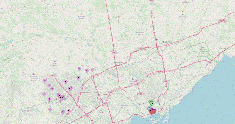
Figure 2: A zoom-in of Yorkville to illustrate clustering of the region
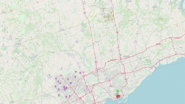
Figure 3: A zoom-in on Brampton to illustrate the dispersion of the region
Spatial Distribution
To further speak to spatial distribution, our team notes some possible explanations for the regions. For instance, the Entertainment and Fashion Districts have a sizeable number of salons and this may be a result of the heightened attention paid to appearance in that area. The Entertainment/Financial Districts are more likely to have such salons and places that specialize in services that pertain to physical appearance, since the district is so engrained within fashion culture. Additionally, a broader observation was made regarding the population density of Downtown Toronto, which played a role in the high number of salons within a given area. This can be suggested regarding Yorkville, which has a highly concentrated cluster of hair salons. It may be the case that the population that this region serves is large enough to sustain a high amount of hair salons in the same area. In terms of Brampton and Newmarket, the large gaps between salons may be a result of having a smaller population. With Brampton and Newmarket being suburbs outside the city, it may be that the population they serve is not as large, which results in a smaller amount of hair salons being open. This observation serves to explain why there is considerable distance between them, as there may not be enough customers available for all the salons to cluster and remain successful. By spreading out, the salons in Newmarket and Brampton are able to provide their services to a higher proximity of neighbourhoods within their respective regions.
Future Directions
The spatial analysis has provided a visual look and a spatial distribution of hair salons on a regional level. This has helped to clarify how these salons exist relative to one another. The future direction this project will focus on is collecting and analyzing data that pertains to the primary variables we seek to examine. These include location, pricing, branding and services offered. By collecting data on these variables, we seek to illustrate differences that may explain the variation in pricing among these salons regionally.
Two aspects we aim to include going forward are average rent/housing prices and the examination of chain pricing. We propose that by collecting information pertaining to the average rent or housing prices in a given region, it can speak to the average cost of goods there. This can help illustrate differences in pricing across regions, by adding the dimension of neighbourhood demographics. We aim to include the measure of rent control and real estate pricing to substantiate this hypothesis. It would add an interesting dimension to the pricing implemented in a given salon, with regards to variation in pricing among the different regions. Similarly, we propose the examination of chain hair salons for a similar reason. Chains, as they pertain to hair salons, participate in consistent pricing across all establishments, regardless of location. By having a measure that is not impacted by location, we are able to have a good baseline of the average cost of such services, since they are resistant to location effects. Chain hair salons could also provide an approximation of price control within a given area, influencing other hair salons to either price match or lower prices altogether. Moreover, chains often brand themselves as being highly affordable, and as such it would be interesting to note what these prices are, especially relative to the pricing we examine all over Toronto. This would be a noteworthy measure to add, in order to create a more comprehensive picture of how pricing seems to operate within and between these hair salons.
By: Nguyen Philippe Dang-Ho, Walid Fattah, Sara Tawanapoor, Jaishree Nayyar & Tianyi Jimmy Xing
There is no shortage of music performance venues in the Toronto area; with hundreds of venues to decide from, our group has chosen to focus on the significance of smaller performance halls in the production of local acts like Drake, Jessie Reyez, Daniel Caesar and Nav, who have beat the odds and made it to the “big leagues”. We have decided to take a look at various venues that promote specific types of artists and musical genres across the GTA, and compare them to venues that are marketed as mixed genre performance venues, alongside major performance centres that will help to bring diversity to the population we are studying. The majority of the venues we are studying are found in the city of Toronto, but we have decided to include several venues located outside of the city limits to compare local artist support in municipalities that are potentially less influential on a larger scale such as venues in Mississauga and Caledon.
Initially, our group had intentions to focus on underground musical performance venues but we quickly realized that operationalizing a definition of an underground venue was very subjective, and can vary depending on who you ask. In the end we decided to broaden the scope of our population to all music venues in the Toronto area and sort them according to the genres of music that are most often showcased at each location. To gather our data for this spatial analysis our group reviewed posts on Blog T.O, Soundscapes, Narcity and Google Maps. The websites our group used for our search provide lists of the “top” venues for musical performances in Toronto and the surrounding areas. They helped us to identify the most popular venues and their success in showcasing/attracting performers from specific musical genres.
After mapping all of the venues, our group was able to pinpoint spatial patterns that show clustering of similar venues along specific avenues or in certain neighbourhoods. Taking a look at the map below, many of the venues are concentrated in Zone 1; this zone is in the city centre and can be regarded as the area with the most expensive ticket prices for events. The most mainstream venues such as the Scotiabank Arena and the Rogers Centre are located within Zone 1. The large size of these venues in particular make them very difficult to have a sold-out show; this implies that the artists performing there are very popular and have the ability to obtain high amount of ticket sales for their events or performances. As the zones progress, it can be seen that the density of locations is much more spatially dispersed. Particularly in Zone 3, many of the well-known smaller local venues that host new or upcoming local artists such as The Opera House, Danforth Music Hall and Drake Underground are located in the outer ring. This shows that smaller venues have a tendency to be situated outside of the main entertainment district where rents are lower, making the areas more affordable for artists who are starting out in their careers. According to Richard Florida (2004), this can all be understood from a social capital perspective, where new artists (intentionally or not) cluster in areas that can help to feed their creativity through social connections and collaborations, while ensuring affordability and proximity to a nearby city centre.
A city like Toronto with a diverse cultural mosaic and a flourishing musical industry definitely benefits from the presence of smaller hubs of performance venues. The area around Kensington market between College Street and Dundas Street West, has a significant agglomeration of thirteen venues that host Rock, Jazz and Live Bands. The nature of these genres can be seen as having similar instrumental foundations which can bring guitarists, vocalists, and drummers together. College and Ossington Avenue is an area where another cluster of small-scale venues are located including Revival Lounge, B-Side Lounge and Night Owl, which all host local small musical acts and live music events. This agglomeration is different than the one in Kensington Market because these venues do not focus on a specific genres of music, and host a wide array of artists from hip-hop, indie and rock bands. Along Bloor Street West another clustering is noticeable in the Bloordale neighbourhood where three pubs have made a name for themselves as locations that host live bands regularly; people go there for the beer, but stay for the music. The last area we’ll discuss is Mirvish Village, not far away from Bloordale Village. This area has a small cluster of four venues that host a wide variety of musical performers and is significant because the neighbourhood is known for its “affordable” housing and is also home to the Randolph Academy for the Performing Arts. It is clear that this neighbourhood appeals to the wider artistic community and in turn, the clustering of various types of artists (musicians, actors and more) can help promote a creative atmosphere (Florida, 2004).
There is definitely a pattern that shows a high density of performance venues located in Zone 1 near the entertainment district of Toronto, but ultimately the majority of the venues we found were located in the outer two zones. This is relative to the idea that artists, especially musicians, tend to settle in areas just outside of the city centre that have more flexible rents. Lower living costs are often unavailable in the areas that are most saturated by a multitude of well established musical performance venues, so artist agglomerations in lower-end neighbourhoods nearby are more common (Patterson and Silver, 2015).
